News values
convergence- refers to the crossing over/ coming together of platforms, teeths, devices in media
galtung and ruge (1981)
These theorists argued that news is structured according to unspoken values, rather than discovered. Here some of their key terms.
key terms:
Frequency- the time scale it happens.
Threshold- "the size of an event that's needed to be considered as newsworthy".
Proximity- "This value is to do with how close to home a story is".
the "Other"- Paul Giroy
non-white people in the media are often defined according to what makes them different from the (white) majority. These values usually negative.
Do the statistics link to the proportion of news coverage?
negativity- if its news, its bad news
predictability- although a key convention of news is to present events as surprisingly, actually a lot of these are predictable.
continuity and narrative- news involves story-telling just like fiction, and it is convenient for journalists to cover stories which are likely to continue over a period of time, with news unfolding. binary oppositions are also used.
binary oppositions: two opposing values/characters. Tension between drive a narrative forward
compositions- Newspapers need to be balanced out, and if the editor feels that there is a disappropriate type of news
personalisation-events are often
Tuesday, 7 November 2017

The news industry
News corp
A conglomerate that owns:
financial services
Wireless media(Radio inc. Talksport and virgin radio)
HarperCollins(Book publisher)
21st century fox
Twenty-First Century Fox Inc. is an American multinational mass media corporation based in Midtown Manhattan, New York City.
subsidiaries:
News corp
A conglomerate that owns:
financial services
Wireless media(Radio inc. Talksport and virgin radio)
HarperCollins(Book publisher)
21st century fox
Twenty-First Century Fox Inc. is an American multinational mass media corporation based in Midtown Manhattan, New York City.
subsidiaries:
preventing any one media owner or voice having too much influence over public opinion and the political agenda.
Power without responsibility
in their book james Curran and jean Seaton argue that the press holds a lot of power, but has little responsibility.
the concentration of ownership(Oligopolies) makes this worse.
Saturday, 14 October 2017
Evaluation of cross platform advertising
| Type |
Strengths
|
Potential problems
|
Examples
|
Viral advertising
| Gets lots of exposure, allows people to be in-control over it. | The owner has no control over the people who are spreading it. | T-mobile dance https://www.youtube.com/watch?v=VQ3d3KigPQM |
Native advertising
| Gives the person a positive surprise, keeps you engaged as you're not aware its an advert. | Annoying as you could be watching it and get annoyed once you find out its an advert. | 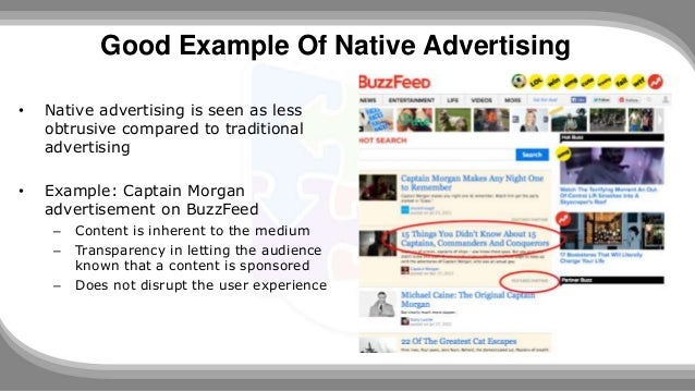 |
Targeted advertising
| Normally appropriate tags for the customers so they are more likely to open the link. | invasion of privacy as they collect data from your profile so they can create pop ups specifically for you. | 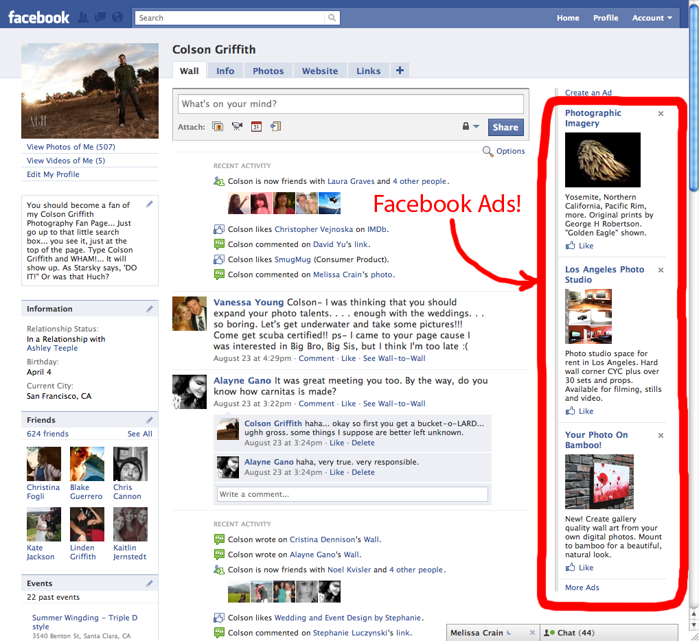 |
Shoppables and Influencers
| Gives new products exposure and allows more people to buy it quick and easily. | causes a lot of traffic on social network sites due to the immense amount of parts that already build up the app/network sites. | 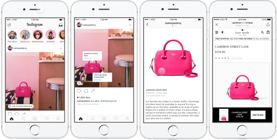 |
Thursday, 12 October 2017
Drama homework- Liberty
During our drama lesson, we started off in minuscule group doing a collective role were we had to choose two lines from our play which showcased a male or female character. In my case, I was in a group with three people were we decided to incorporate two lines which were "I'm never in a hurry, that's how I get ahead and I understand woman, go along. We choose these lines because: they showcase masculine supremacy, and demonstrate the Male characteristics within the play. We decided to add gesture, movement and experimented with tone to enhance our voices as a unit. For the gesture, we started of standing sideways one-by-one to make ourselves look powerful and have more authority. furthermore, we used hand gestures such as: flicking our wrists towards the audience to show that "we are never in a hurry" as that gesture could connote a lack of interest.
Moreover, we also had another gesture when we said "go along" which was swaying our arms at the same time sideways. This was used to show that the character desperately wanted this person to "go along". The movement we used was moving back and forth once in unison. The stopping of our feats made us look superior and intimidating. Therefore, adding the stopping as well as the movement up and down made us seem much more macho and demonstrated that the male people we were trying to represent are dominant and controlling within this play.
When we where experimenting with tone, we established that we had to say the words with a sense of purpose. In order to pull this off, we said it slower and with more clarity. Unfortunately, we struggled with saying it all together which made it tricky to pull that off effectively. The reason why we did this exercise was to help us acknowledge that we could speak in unison and enhance the character in a powerful way. We also did this to enable us to understand the character better as doing it with various people allows us to witness the character from different prospective.
Afterwards, we created three tableaux which revealed the stories of a specific scene. I was working with another group due to the fact that my group partner wasn't in. However, they had a character which was quiet similar to my character. The first tableaux was the young woman sitting down whilst the doctor was trying to examine her pulse. The young woman was looking down which made her seem distraught and she was in a bed to showcase that she was ill. The second tableaux illustrated different levels and facial expression. It did this as: the young woman was sitting down and shading her face slightly to show that she was disgusted by us and ill, the doctor looked quite professional and profound. Also, the nurse was crouching a little and I had a ginormous smile which made me look like a joker of a husband. I was also crouching but was slightly higher than the nurse which emphasised my joker personality. Whilst,I was giving the nurse the flowers.
The tableaux I liked the most was from prosecution where the juries was staring sternly at the person they were questioning. This included proxemics as the woman was being closely guarded from both sides which made her feel trapped. Consequently, from the person they were questioning she put a quiet intense face which made her looked pressured and venerable. The purpose of these tableaux was to demonstrate what was going on within a scene through mere still pictures.
During our drama lesson, we started off in minuscule group doing a collective role were we had to choose two lines from our play which showcased a male or female character. In my case, I was in a group with three people were we decided to incorporate two lines which were "I'm never in a hurry, that's how I get ahead and I understand woman, go along. We choose these lines because: they showcase masculine supremacy, and demonstrate the Male characteristics within the play. We decided to add gesture, movement and experimented with tone to enhance our voices as a unit. For the gesture, we started of standing sideways one-by-one to make ourselves look powerful and have more authority. furthermore, we used hand gestures such as: flicking our wrists towards the audience to show that "we are never in a hurry" as that gesture could connote a lack of interest.
Moreover, we also had another gesture when we said "go along" which was swaying our arms at the same time sideways. This was used to show that the character desperately wanted this person to "go along". The movement we used was moving back and forth once in unison. The stopping of our feats made us look superior and intimidating. Therefore, adding the stopping as well as the movement up and down made us seem much more macho and demonstrated that the male people we were trying to represent are dominant and controlling within this play.
When we where experimenting with tone, we established that we had to say the words with a sense of purpose. In order to pull this off, we said it slower and with more clarity. Unfortunately, we struggled with saying it all together which made it tricky to pull that off effectively. The reason why we did this exercise was to help us acknowledge that we could speak in unison and enhance the character in a powerful way. We also did this to enable us to understand the character better as doing it with various people allows us to witness the character from different prospective.
Afterwards, we created three tableaux which revealed the stories of a specific scene. I was working with another group due to the fact that my group partner wasn't in. However, they had a character which was quiet similar to my character. The first tableaux was the young woman sitting down whilst the doctor was trying to examine her pulse. The young woman was looking down which made her seem distraught and she was in a bed to showcase that she was ill. The second tableaux illustrated different levels and facial expression. It did this as: the young woman was sitting down and shading her face slightly to show that she was disgusted by us and ill, the doctor looked quite professional and profound. Also, the nurse was crouching a little and I had a ginormous smile which made me look like a joker of a husband. I was also crouching but was slightly higher than the nurse which emphasised my joker personality. Whilst,I was giving the nurse the flowers.
The tableaux I liked the most was from prosecution where the juries was staring sternly at the person they were questioning. This included proxemics as the woman was being closely guarded from both sides which made her feel trapped. Consequently, from the person they were questioning she put a quiet intense face which made her looked pressured and venerable. The purpose of these tableaux was to demonstrate what was going on within a scene through mere still pictures.
Wednesday, 11 October 2017
Tuesday, 10 October 2017
Media
 |
| 2.victoria secret blossoms |
 1.Boss
How the media portrays gender within fragrances.
As I have illustrated, there are two print adverts both of
which are for fragrances and are specifically aimed at men or women. Within the
media, gender is essential as it demonstrates who the target market is for and
who should be buying the product. Gender is the sexual orientation of a person.
Another key term is patriarchy which is: dominant ideologies within society which
make woman look inferior. Objectification is also an important term which means:
degrading someone to the status of something as in significant as an object. These
are key terminology which will be used to sum up and showcase these images. Advert
one is an image of a man who looks, macho, classy, professional; whilst a woman
is at the back of him acting extremely seductive. Advert two, is of a quite feministic
woman who is holding a bottle of perfume.
Advert one
The first print advert incorporates denotations such as: a
man wearing a suit, a woman where we can only see a strip of her clothing and
mainly her skin. Also, the fragrance bottle, additional writing and the logo
which has all been Photoshop into the image. This is all the mise en scent
within the image. The print advert has an anchorage which states “The SCENT, THE
NEW FRAGRANCE FOR MEN”. The use of this anchorage solidifies that the product
is for men this is because: it’s written all in bold to connote that product is
masculine as bold letters make words look superior and dominant. Furthermore,
it also says “for men” which reinforces that the product is “for men”. Moreover,
it also uses repetition of “the” which is a pathos technique to persuade people
to buy the product. The woman has one
strip of her clothing to connote that she is sexually attracted to the man and
is desperately trying to get his attention. The picture also includes high key
lights on small sections of their faces to make people acknowledge there facial
expression and make them look aesthetically pleasing in a manipulative way. In
this image the woman is being objectified as she is leaning towards him almost
as if she is his property. Also, the way she dresses may connote venerability as
she doesn’t look like she is wearing much clothes whereas, the man is wearing a
suit which makes him look powerful in comparison to the woman who is not
wearing much on. This picture is reinforcing stereotypes as she seems to be
inferior to the man. This picture is upholding patriarchy as the man seems to
be the dominant one and is wearing a suit which shows that he has more
authority in society. This image has been Photoshop as one eyebrow appears to be more slanted than the other and there is also editing on the lights to showcase specific parts of the face. In this image, there is binary oppositions as there is a man who's the more dominant one within the image and a woman who seems to be inferior to him.
Advert two
The second print advert consists of denotation such as: a
woman wearing a pink bra holding the perfume, a window in the background and additional
writing as well as whom the product is by. The print advert has the anchorage “life
is fabulous”. The typeface of “fabulous “is pretty stylish which may connote
that the product is specifically for women. In addition to this, the writing is
in pink which reinforces stereotypes as pink is genuinely associated to girls.
This makes the fragrance look feminine. This female perfume doesn’t say it’s
for woman it just infers by using the colour pink, showcasing a woman with the
product and actually making the fragrance have a pink colour. Furthermore, the
woman also only wears a bra which is slightly seductive however attracts woman
by making them think that if she is looking so beautiful with this perfume; I
should use it too. Moreover, the camera used on the image is a high key light
which makes it look aesthetically appealing. The woman is holding the perfume close
to her which may appear to be “sexy”. The ways she’s holding it may support the
anchorage of “irresistibly fresh” as she is holding it as if it is absolutely “irresistible”.
In this print advert the woman is being
objectified discreetly as she is wearing a bra and holding perfume almost as if
she is for sell as well . The advert supports patriarchy as the woman is still
seen as less important within her society. The image has been airbrushed as it consists of a woman's body being more slanted than usual. The woman looks slimmer than her head which makes the image look airbrushed. Consequently, the woman was also added separately which shows that it was Photoshop. The image does not consist of any binary opposites as it is all a girly theme and there is nothing opposing that.
Conclusion
From looking at these two advert, I have learnt that women are commonly portrayed as being girly or seductive with the media industry. Furthermore, I have also learnt that within advertisement they put in various parts of images, typefaces, pictures ...to slightly hint who they are targeting the product for. For example, the woman in Advert one is purposely leaning unto the Man to show she is attracted to him perhaps due to him using the cologne. This reveals to men that the product is for men as it is attracting a women to a man. I think that gender stereotypes are still prevalent in advertising however it is done more undercover. This is due to industries such as ASA and UN who have been challenging this dominant patriarchy. They have prevented it by: banning sexualised advertisements, stating that:
"While advertising is only one of many factors that contribute to unequal gender outcomes, tougher advertising standards can play an important role in tackling inequalities and improving outcomes for individuals, the economy and society as a whole." This inferred that the ASA wanted to abolish gender stereotypes to "improve" society and make society more equal. Similarly, the UN also had a part to play as they wanted to make both genders be treated equally. They also believed that advertising had a huge impact on equality and therefore should be used to reinforce equality; and not break it. I think that these movements have helped exponentially as due to their intervention in this matter; 24 countries have restricted gender stereotypes in advertising.
Conclusion
From looking at these two advert, I have learnt that women are commonly portrayed as being girly or seductive with the media industry. Furthermore, I have also learnt that within advertisement they put in various parts of images, typefaces, pictures ...to slightly hint who they are targeting the product for. For example, the woman in Advert one is purposely leaning unto the Man to show she is attracted to him perhaps due to him using the cologne. This reveals to men that the product is for men as it is attracting a women to a man. I think that gender stereotypes are still prevalent in advertising however it is done more undercover. This is due to industries such as ASA and UN who have been challenging this dominant patriarchy. They have prevented it by: banning sexualised advertisements, stating that:
"While advertising is only one of many factors that contribute to unequal gender outcomes, tougher advertising standards can play an important role in tackling inequalities and improving outcomes for individuals, the economy and society as a whole." This inferred that the ASA wanted to abolish gender stereotypes to "improve" society and make society more equal. Similarly, the UN also had a part to play as they wanted to make both genders be treated equally. They also believed that advertising had a huge impact on equality and therefore should be used to reinforce equality; and not break it. I think that these movements have helped exponentially as due to their intervention in this matter; 24 countries have restricted gender stereotypes in advertising.
Wednesday, 20 September 2017
The Advertisement "Equality" for Nick
This Advertisement demonstrates the theme of equality and is targeted towards people of all age ranges. This is due too: the huge amounts of commemorative items, the different size ranges on their products and the famous people used to give the products credibility. The advertisement was created by Wieden and Kennedy in the United States to illustrate the clothing line as well as anything else associated to the fashion industry of Nike. What happens in the advert is: various people are playing sports whilst famous sports players in society or ordinary people are spray-painting or adding to the anchorage of the theme of equality. This advert suggests to the audience that everybody should be entitled to a piece of Nick clothing or should be wearing it to be equal to everybody else. The advert showcases this as it repetitively uses famous sports people at specific parts of the advert who are wearing Nick clothing. These famous people add credibility. Moreover, the advert is emotionally straining as it deals with delicate matters regarding equality and solidifies this with the anchorage towards the end -"equality has no boundaries".
The camera filter is black and white throughout to possibly reflect that everyone in society can own a piece of nick clothing despite their colour as "equality has no boundaries" which is referenced quite often in the advert. The advert starts with a blackout which could be used to immediately grab your attention on what's going on. Afterwards, it shows a bird eye view of a part of the united states which gradually zooms onto a basketball court and immediately switches to an establishing shot of the basketball court. This is purposely done to shift our focus on a specific place in this case, the basketball court. Eventually, there is a medium shot of Lebron James where he is looking at the camera to draw the attention of the people who are watching the advert. The camera shots each time are slow and gradually becomes quicker each time to make the viewers acknowledge that there is a constant shift of focus on specific people and what they are trying to represent within this equality advert. The advertisement is non diegetic as it consists of a backing track which cannot be heard by the people in the advert. However, it can be heard by the people viewing the advertisement. This gives the impression that the advert is quite symbolic as we can hear music in the background with a speech. The music and the speech could suggest that "your looks and beliefs" do not apply when you are purchasing some Nike clothing. Furthermore, the music in the background and the speech is slow so that it is more understandable and to also add to the emotion that might be felt watching this advert.
The props, costumes, setting and make up used are: sports equipment such as basketballs and tennis rackets, Nike branded clothing which are sports based, typical streets of America which have sports courts and simplistic make up which isn't to distinctive. There are sports courts with people using sports equipment which showcases that the products Nike create are mainly sports based. Also, there are famous sportsmen which are wearing Nike clothing. This makes people want to buy the products as famous sportsmen are wearing it and if they see that they are wearing it people may want to buy it too. The advert is set in America which shows that the brand Nike is based in America. The background is dull to make the advert seem more simplistic and further reveal that "equality has no boundaries" in their clothing line. During the advert, there seems to be no extended make up being warn which possibly reflect that they are athletes so do not need access make-up to perform their duties as sportsmen.
Within the advertisement, there is a speech which highlight the importance of unity, togetherness and diversity all of which is associated to the theme of equality which is being expressed in this advertisement. This is emotional for people that are viewing the advertisement as it is displaying delicate matters regarding equality. Equality is extremely essential in everyday lives as everyday wants to be treated fairly and justly. This makes people sympathise with the video as people understand the importance of being treated equally and can relate. This speech is also the anchorage as it supports what the video is trying to portray. The video also incorporated the logo on pieces of clothing and towards the end. This logo is a simple tick. The logo suggests that the advert is for Nike and is used at the end to show that the advert is meant to get people to buy Nike clothing.
The Advertisement consists of persuasive techniques such as: pathos and ethos. Ethos would be the credibility this includes, the sportsmen, and Alessia keys who is a singer-songwriter. I think the advertisers have used them because: Alessia keys phenomenally influential woman who clearly references or talks about equality within her songs as well as speeches. The sports people are also used as the clothing line is mainly sportswear so by using sports people it will be a more trustworthy product and people are more likely to buy it. Whereas, pathos would be the emotions, in this case, people may feel sympathy, comfort and hope. I think this because the words are emotionally meaningful there by providing people with hope that there can be equality within our society on a broader scale. It also makes people think about the less fortunate who cannot afford Nike clothing or are being treated unfairly.
Subscribe to:
Posts (Atom)
-
Media- newspaper story analysis The news story I am addressing is "BECKY FIEND WEDS Becky Watts Killer Shauna Hoare wants to marr...
-
Modes of address direct/indirect Direct- speaking to the viewer directly, using you or your(but not always)and it reinforces preferred rea...
-
Media 2.victoria secret blossoms 1.Boss How the media portrays gender within fragrances. As I have illu...

